First Win Lab (Interactive prototype)
1) Project Brief
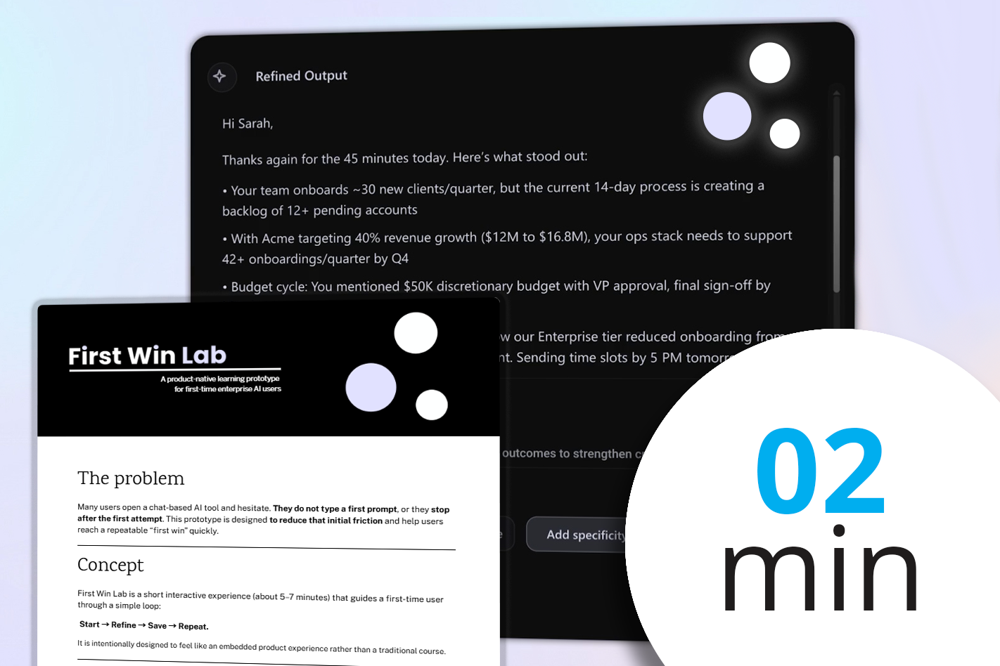
A short overview of a microlearning experience called First Win Lab: what it is, the problem it solves (getting people to type their first prompt in an AI tool), and the three learning outcomes (start, refine once, save for reuse). The project brief includes the key design decisions and a short style guide.
2) Video Primer
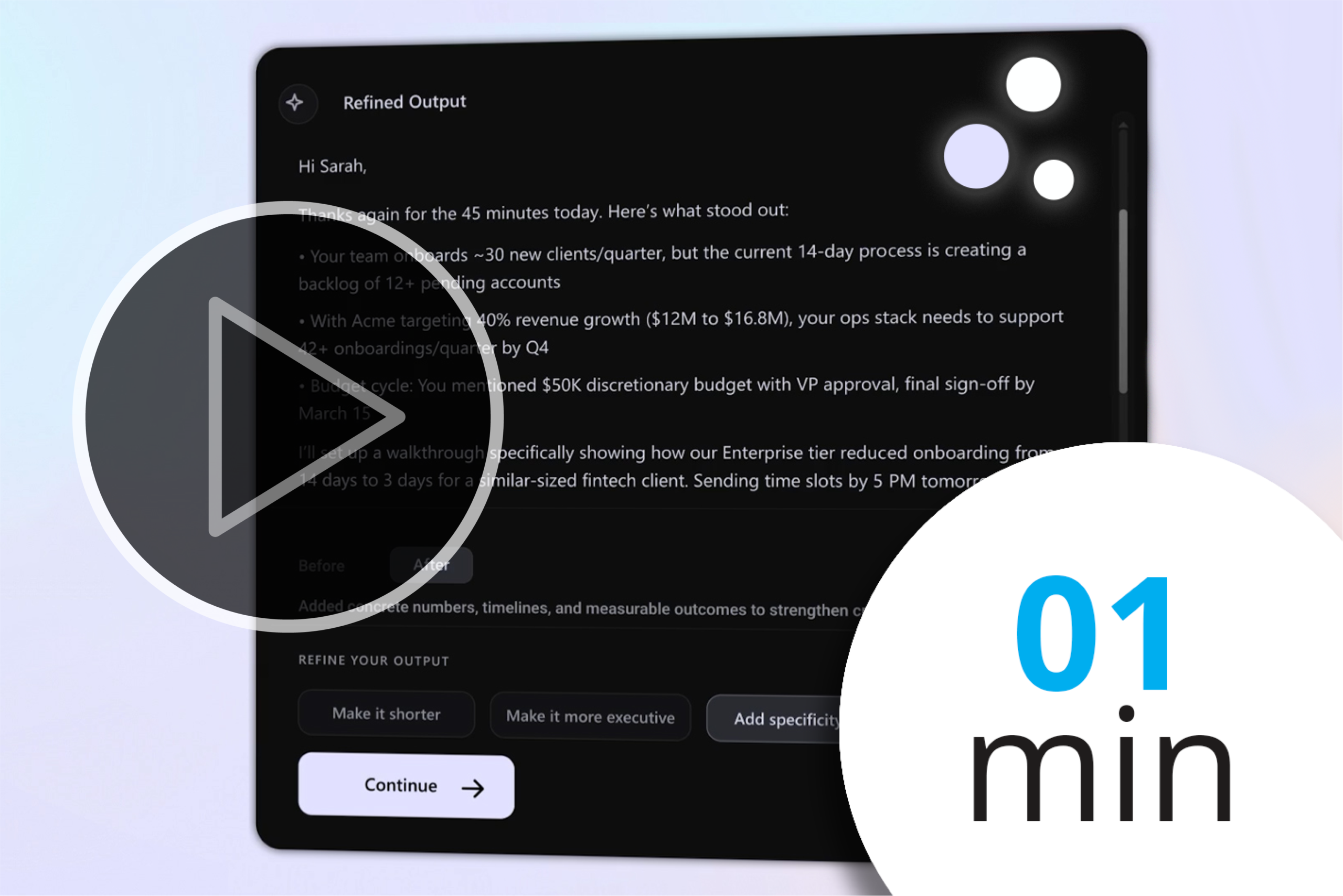
A quick explainer video that shows what you’ll do in the lab: choose a use case, add context, run a prompt, refine once, and save a reusable template. The video has a minimal, UI-first design and is skippable. Designed with the usual Adobe suspects: After Affects, Premiere Pro, Illustrator and some Figma.
3) The App
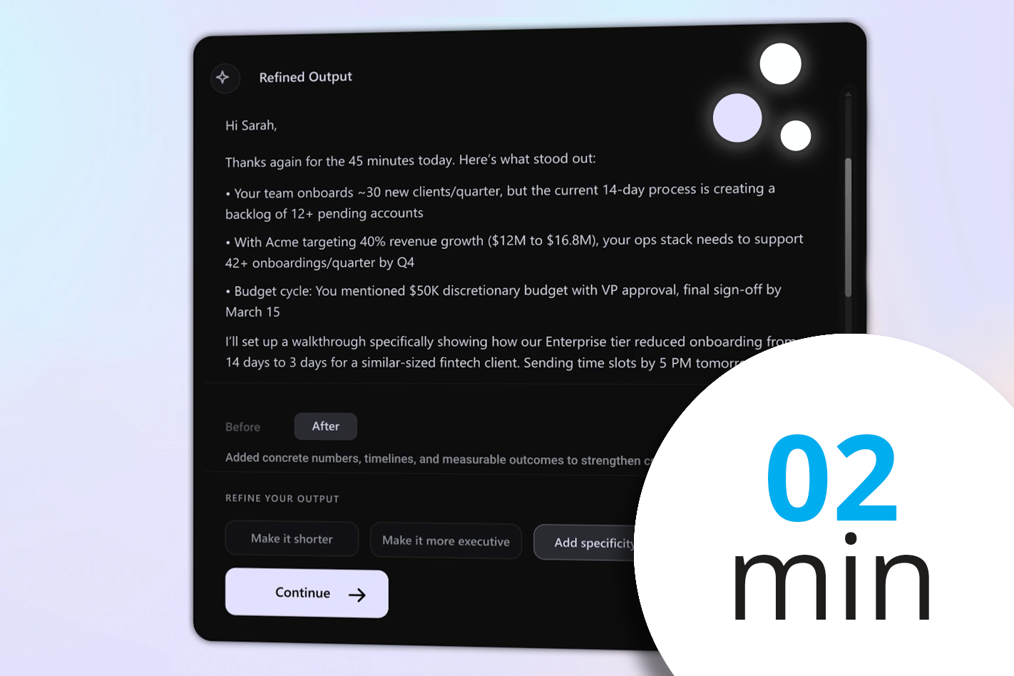
A short, hands-on experience that helps a first-time user go from a blank chat box to a usable output in minutes. It is intentionally designed to feel like a product experience, not eLearning.
The prototype uses live AI output (API), guided tips, a single refinement step, a quick quality check, and an option to save the prompt and add a calendar reminder to support repeat use
Learning
The Anatomy of Coffee

This short module is part of a larger blended-learning course for baristas on coffee making knowledge and customer service. Module 2, The Anatomy of Coffee guides learners through espresso, cappuccino, and flat white preparation and brings together coffee knowledge with hands-on practice. I developed this using Articulate Rise and Storyline along with some custom graphics and JavaScript. It includes animated videos and tactile, interactive coffee making interactions.
From omnichannel marketing data to business review
This 10-minute interactive lab shows how WRITER can turn omnichannel marketing data into a first-pass business review. Learners work through a realistic life sciences scenario and review the output before refining it.
I created this as part of a pre-employment interview exercise for WRITER. All content shown is based on publicly available information. WRITER trademarks and branding are shown solely in the context of the original exercise and the persona and company example are fictitious.
Sophie the French Reading Guide

This is a Proof of Concept I’m currently working on to help my 7-year-old daughter learn French. In addition to using the full Javascript capabilities of Articulate Storyline, this course uses speech-to-text, Python scripting, and AI (in this case GPT 5.2) to provide a personalized language learning experience.
The avatar, Sophie, was designed with Adobe’s Character Animator. This is mostly focused on language learning, but I reckon the architecture of this project is versatile enough to support a range of scenario-based learning situations like behavioral interviews, customer service, or product training, especially when integrated with an SQL database.
Videos
Cappuccino and How to Make It
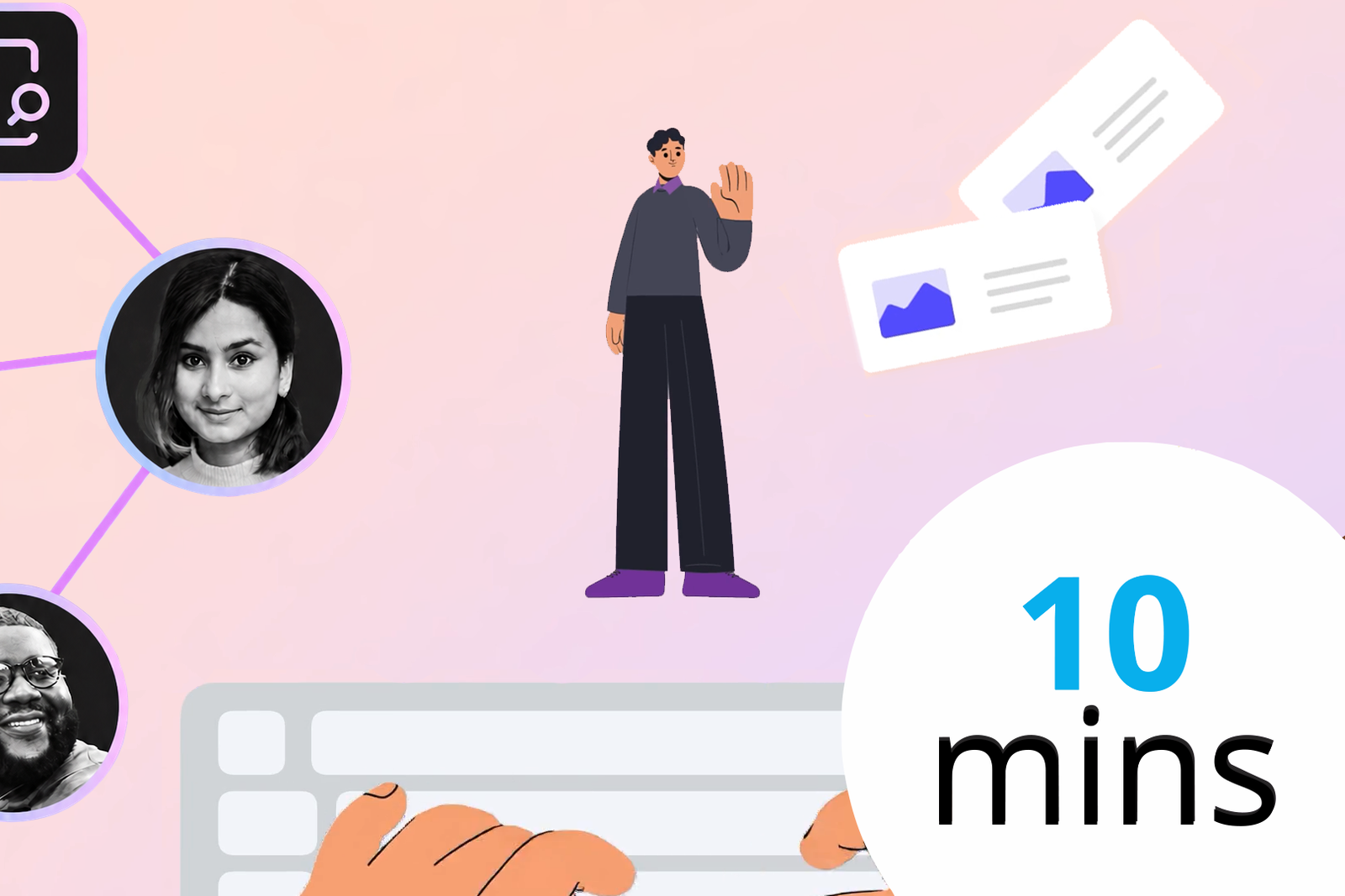
A short animated introduction designed to help new learners quickly understand WRITER and how its core ideas fit together. I designed the visual system, scripting, and motion to make a complex product feel approachable from the outset via a persona called Sam.
Promotional Video (espritEducate)

espritEducate isn’t a business, but if it had a marketing video, it would probably look something like this. This was made for fun using Premiere Pro, Vyond, After Effects and other Adobe Suite programs (PS, AI, and Audition).
Taplee Opening Credits
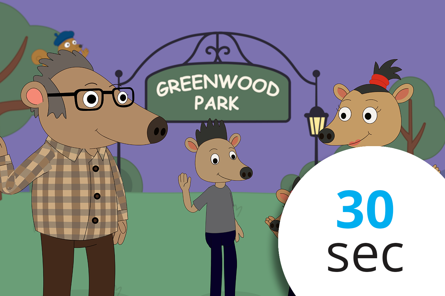
These are the opening credits for an original children’s animated TV series I’m developing, Taplee. The animation is built with Illustrator artwork in Adobe Animate, then animated frame by frame (yikes!). I wrote and recorded the theme song in Logic.
This is a passion project that will take a while. Don’t they all?
Job Aids
The Realities of Workplace Learning in 2025

This nine-slide LinkedIn carousel explores why continuous learning—not college degrees—is the engine of career and business growth. I made this with PowerPoint and Illustrator, with the goal of turning some simple stats around learning into a data story. Visually the idea was to blend icons with charters where possible.
AI for L&D - A Quick
Reference Guide (2023)

A good job aid should generally follow a few principles. Here, I try to use a clear, color-coded matrix design, aligning three key roles of an instructional designer with each benefit. This was created in PowerPoint. It follows the ‘rule of threes,’ (the content is organized into three distinct chunks). Following a Z-pattern, the layout guides the viewer’s eye, while the use of chunking breaks each theme into accessible elements.
Data learning series: Part 1 - Storytelling

This is a Google Slides deck I created for the first of three virtual instructor-led sessions (VILTs) on data literacy. It’s designed for simplicity, using minimal text and bold color cues to facilitate participant interaction and underscore key learning points. A good deck comes with easy facilitator notes, including cues for transitions and audience engagement.